Acseine
Acseine
Acseine is a Japanese skincare brand focused on hypoallergenic skincare for sensitive skin.
From 2021–2023, I worked across social media content, developing visual communication for product and brand messaging across static and motion formats. The work focused on translating the brand’s clinical and gentle character into a visual language that felt clear, calm, and approachable.

THE OUTCOME
THE OUTCOME
The visual direction brought Acseine’s clinical background and gentle skincare positioning into a more consistent social media language.
Across static and motion content, the system created a calm and restrained visual character while leaving enough flexibility to communicate different products and messages.
The visual direction brought Acseine’s clinical background and gentle skincare positioning into a more consistent social media language.
Across static and motion content, the system created a calm and restrained visual character while leaving enough flexibility to communicate different products and messages.
THE OUTCOME
The visual direction brought Acseine’s clinical background and gentle skincare positioning into a more consistent social media language.
Across static and motion content, the system created a calm and restrained visual character while leaving enough flexibility to communicate different products and messages.





THE CHALLENGE
THE CHALLENGE
The challenge was to balance Acseine’s clinical character with the softer, more approachable side of skincare.
The visual language needed to communicate a sense of care and precision without becoming overly sterile or technical.
This meant finding the right balance between clarity, softness, and restraint across different types of social content.
The challenge was to balance Acseine’s clinical character with the softer, more approachable side of skincare.
The visual language needed to communicate a sense of care and precision without becoming overly sterile or technical.
This meant finding the right balance between clarity, softness, and restraint across different types of social content.
THE CHALLENGE
The challenge was to balance Acseine’s clinical character with the softer, more approachable side of skincare.
The visual language needed to communicate a sense of care and precision without becoming overly sterile or technical.
This meant finding the right balance between clarity, softness, and restraint across different types of social content.
THE EXECUTION
THE EXECUTION
Visual Direction
A restrained visual language was developed through a light blue and white palette, generous white space, and clean layouts to create a calm and focused visual environment.
Static & Motion
Static assets used clear information hierarchy and structured compositions, while motion introduced softer, more fluid movement to add variation to the content.
Product Photography Direction
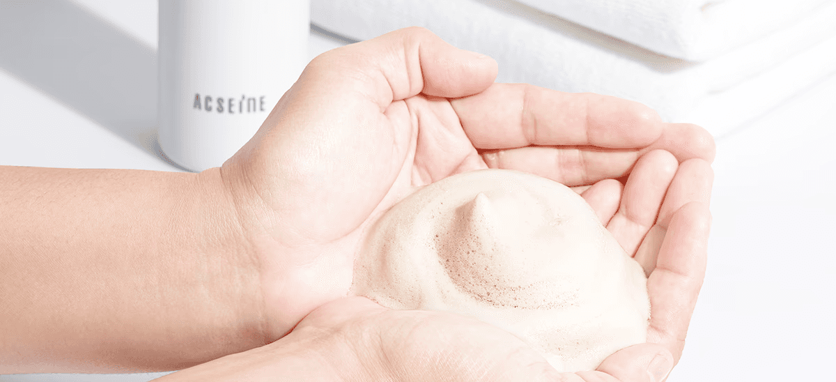
Developed the art direction for product photography, including visual references, composition, lighting, and styling direction. Worked closely with freelance photographers throughout the shoot, providing feedback to ensure the final imagery aligned with the overall visual direction.
Content System
The visual approach was adapted across different product stories and social content while maintaining a consistent overall character.
Visual Direction
A restrained visual language was developed through a light blue and white palette, generous white space, and clean layouts to create a calm and focused visual environment.
Static & Motion
Static assets used clear information hierarchy and structured compositions, while motion introduced softer, more fluid movement to add variation to the content.
Product Photography Direction
Developed the art direction for product photography, including visual references, composition, lighting, and styling direction. Worked closely with freelance photographers throughout the shoot, providing feedback to ensure the final imagery aligned with the overall visual direction.
Content System
The visual approach was adapted across different product stories and social content while maintaining a consistent overall character.
THE EXECUTION
Visual Direction
A restrained visual language was developed through a light blue and white palette, generous white space, and clean layouts to create a calm and focused visual environment.
Static & Motion
Static assets used clear information hierarchy and structured compositions, while motion introduced softer, more fluid movement to add variation to the content.
Product Photography Direction
Developed the art direction for product photography, including visual references, composition, lighting, and styling direction. Worked closely with freelance photographers throughout the shoot, providing feedback to ensure the final imagery aligned with the overall visual direction.
Content System
The visual approach was adapted across different product stories and social content while maintaining a consistent overall character.


Anastasia Miary
Campaign & Communication
2021 - 2023
2021 - 2023
Anastasia Miary
Campaign & Communication
2021 - 2023
2021 - 2023
Anastasia Miary
Campaign & Communication
2021 - 2023
2021 - 2023
Anastasia Miary
Campaign & Communication
2021 - 2023
2021 - 2023

Clinixir
Digital Experience
2025
2025
Clinixir
Digital Experience
2025
2025
Clinixir
Digital Experience
2025
2025
Clinixir
Digital Experience
2025
2025
©2026 Saowanee K
Go Back To Top
©2026 Saowanee K
Go Back To Top